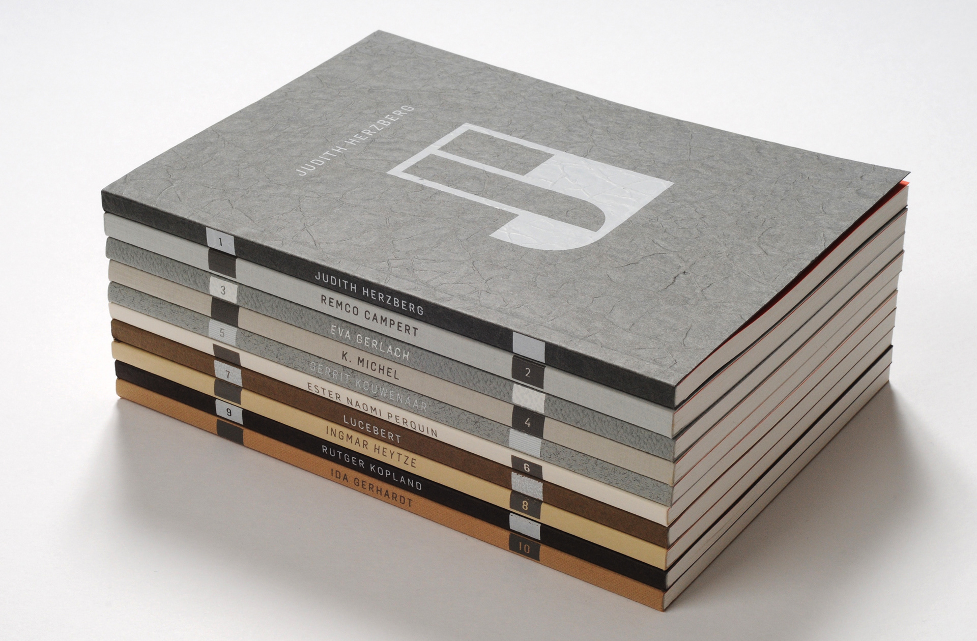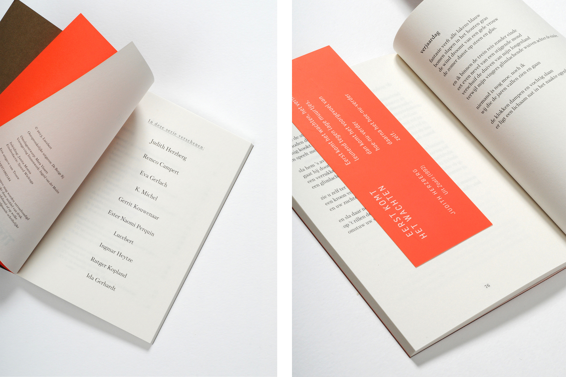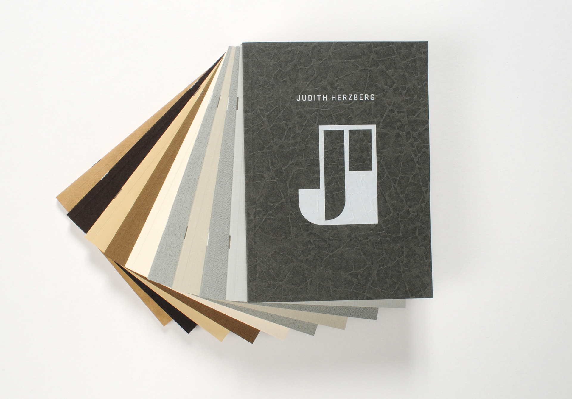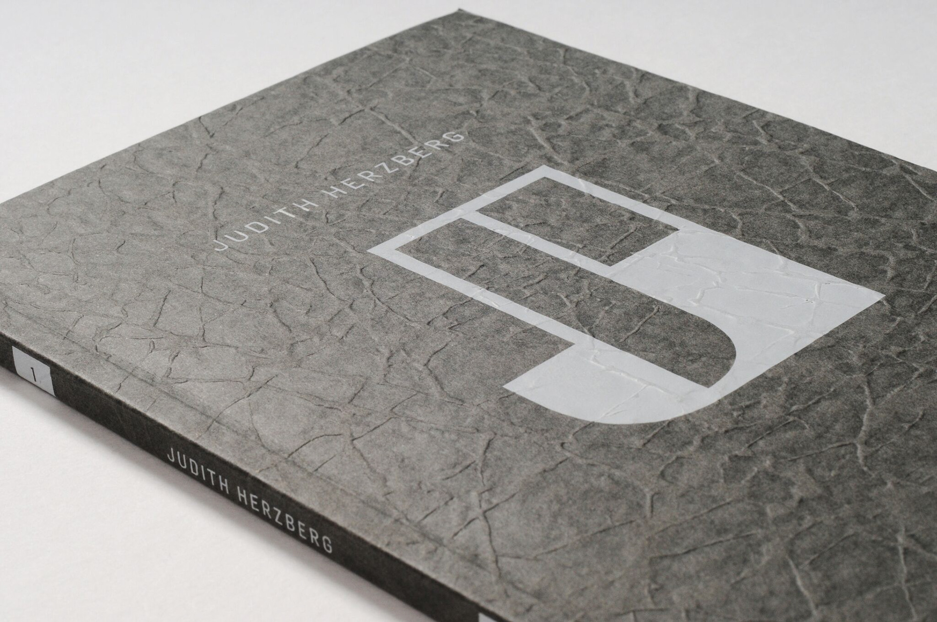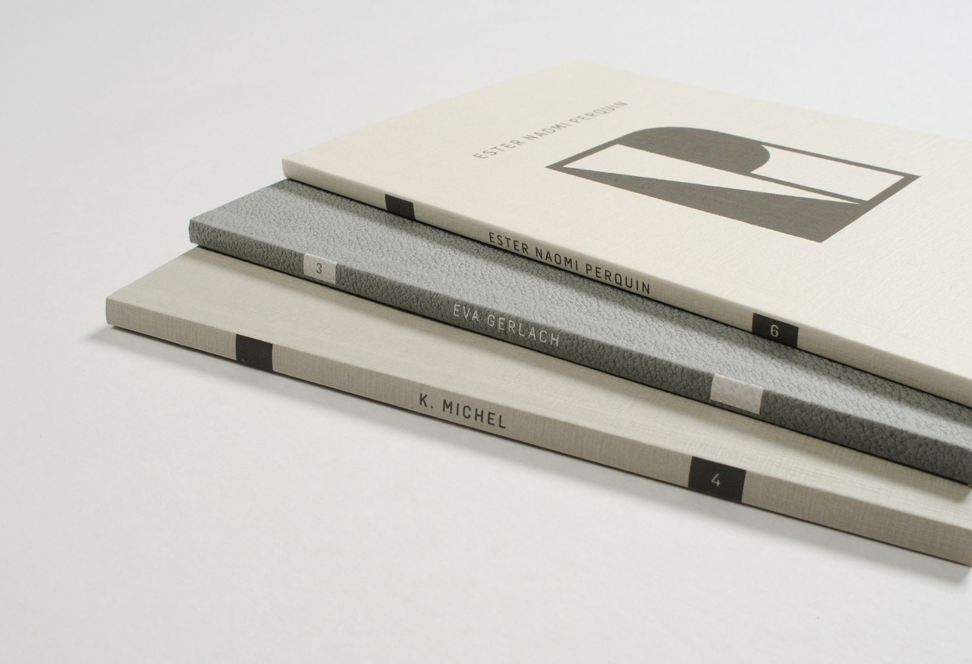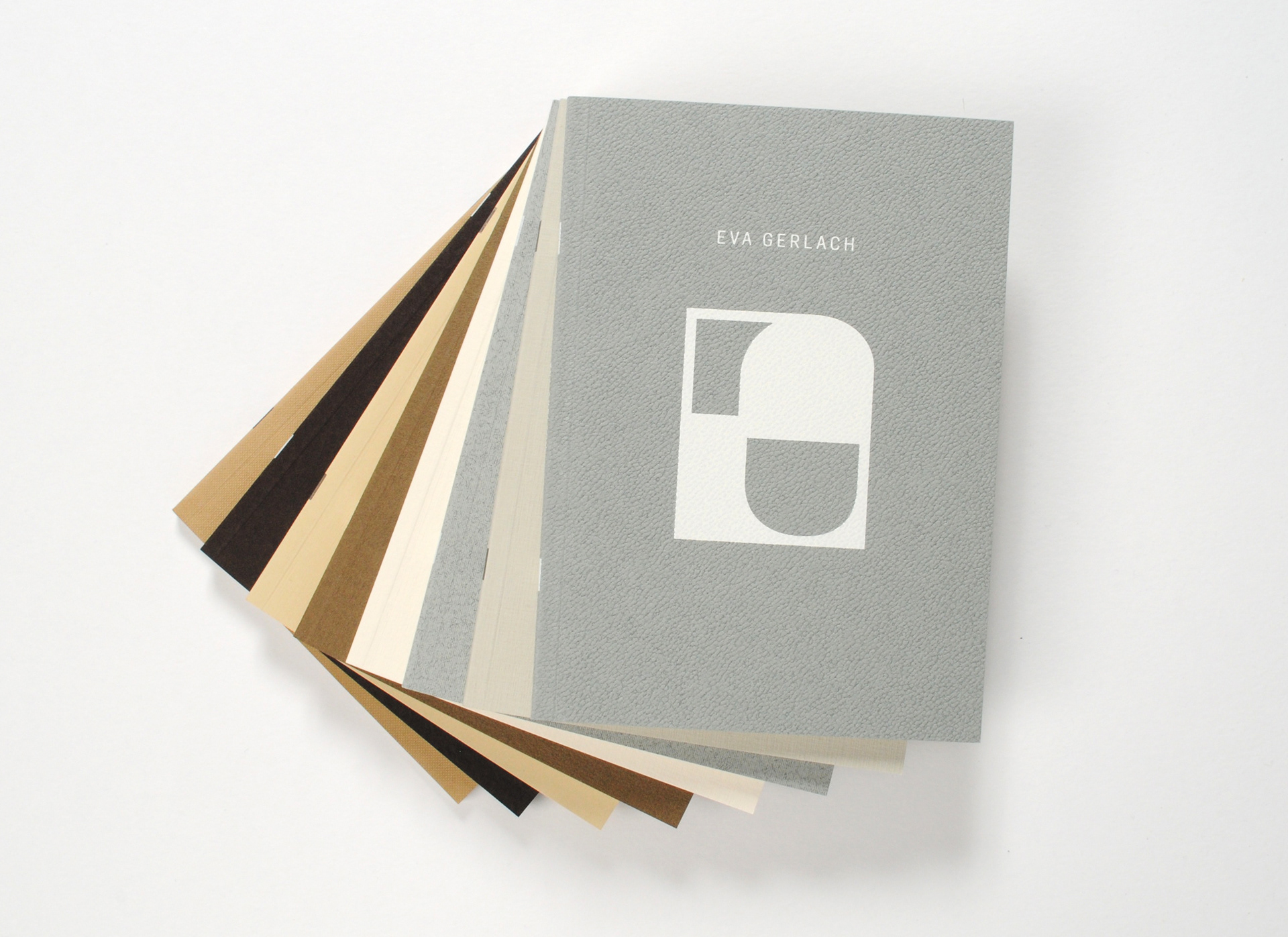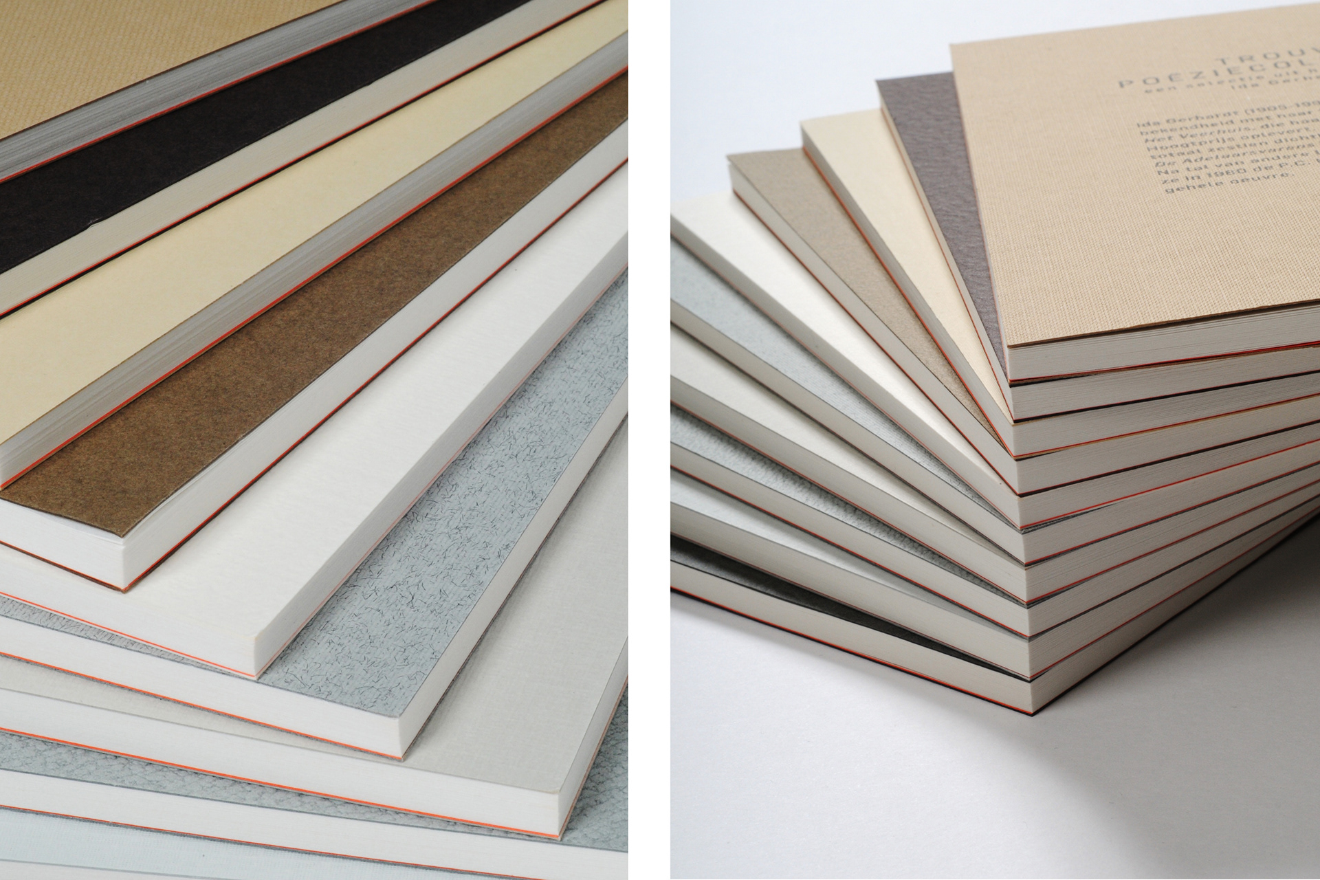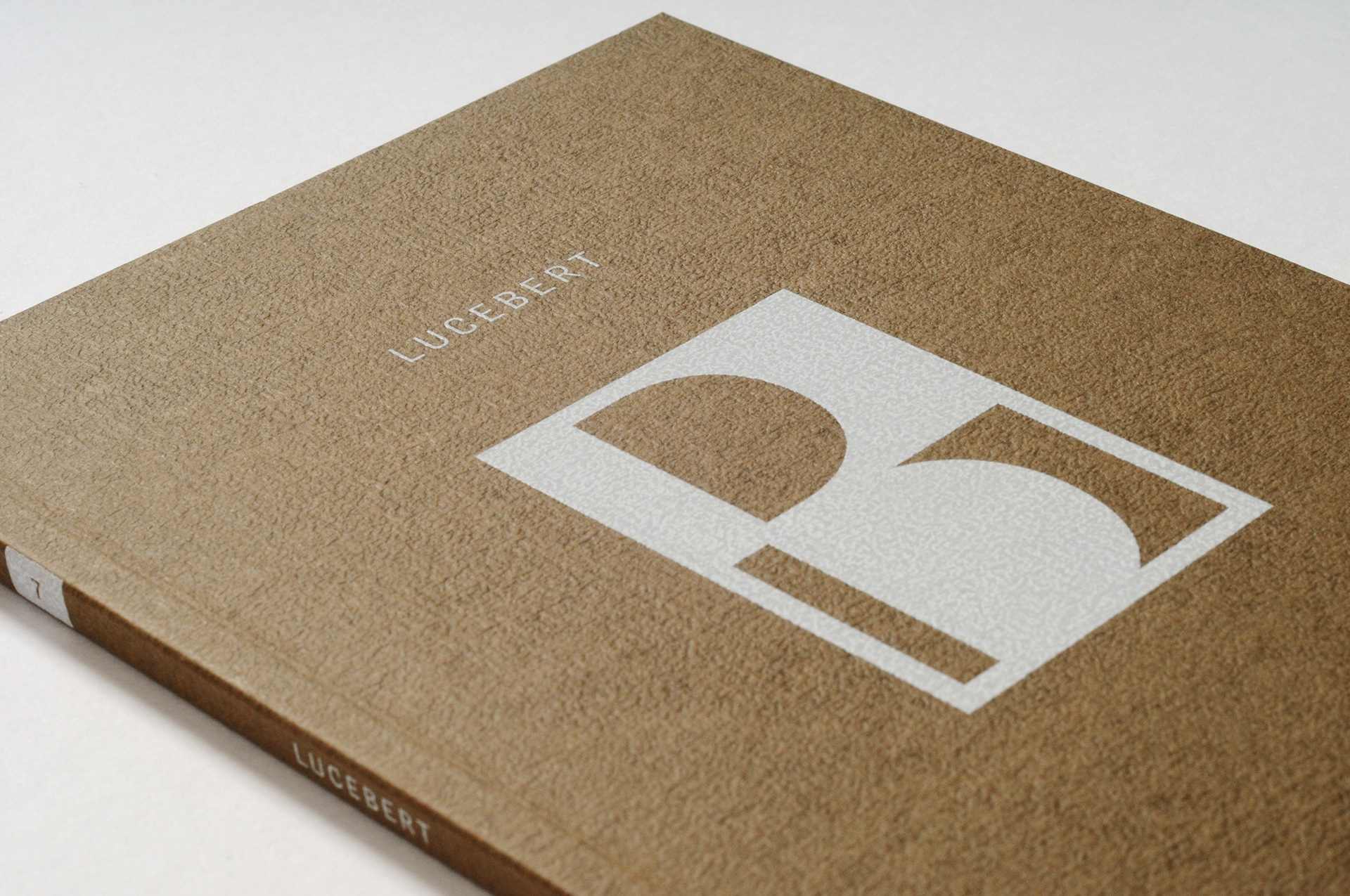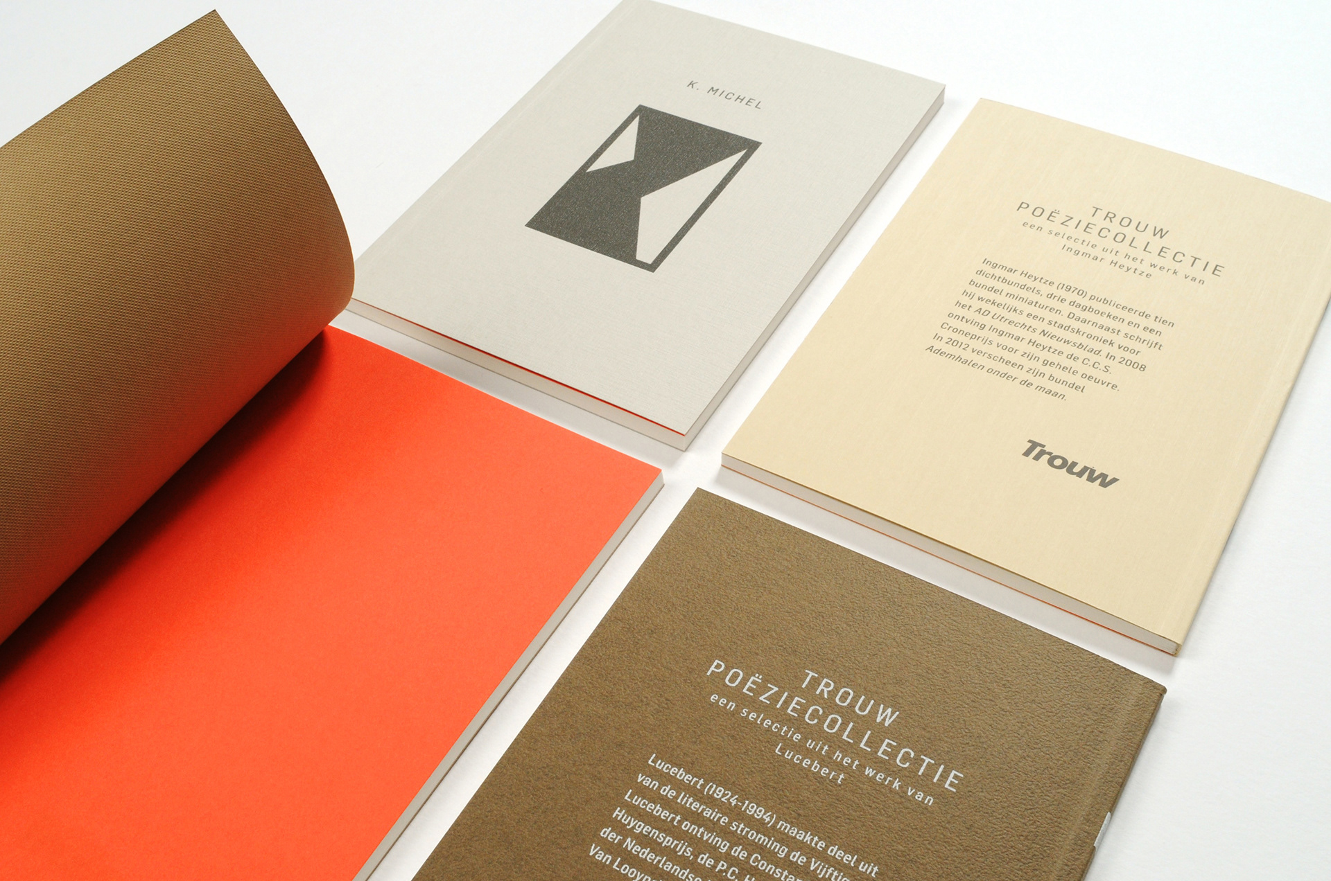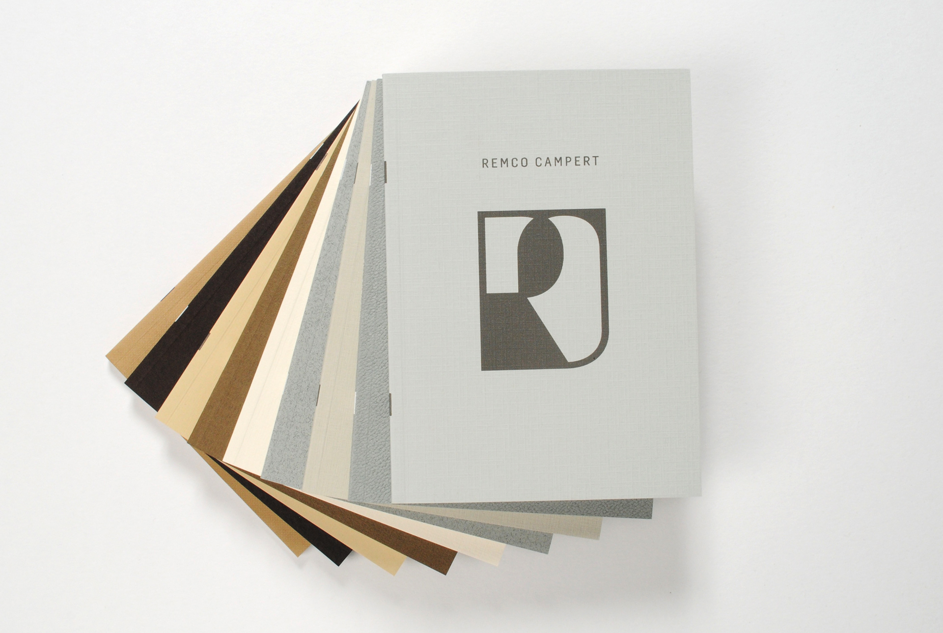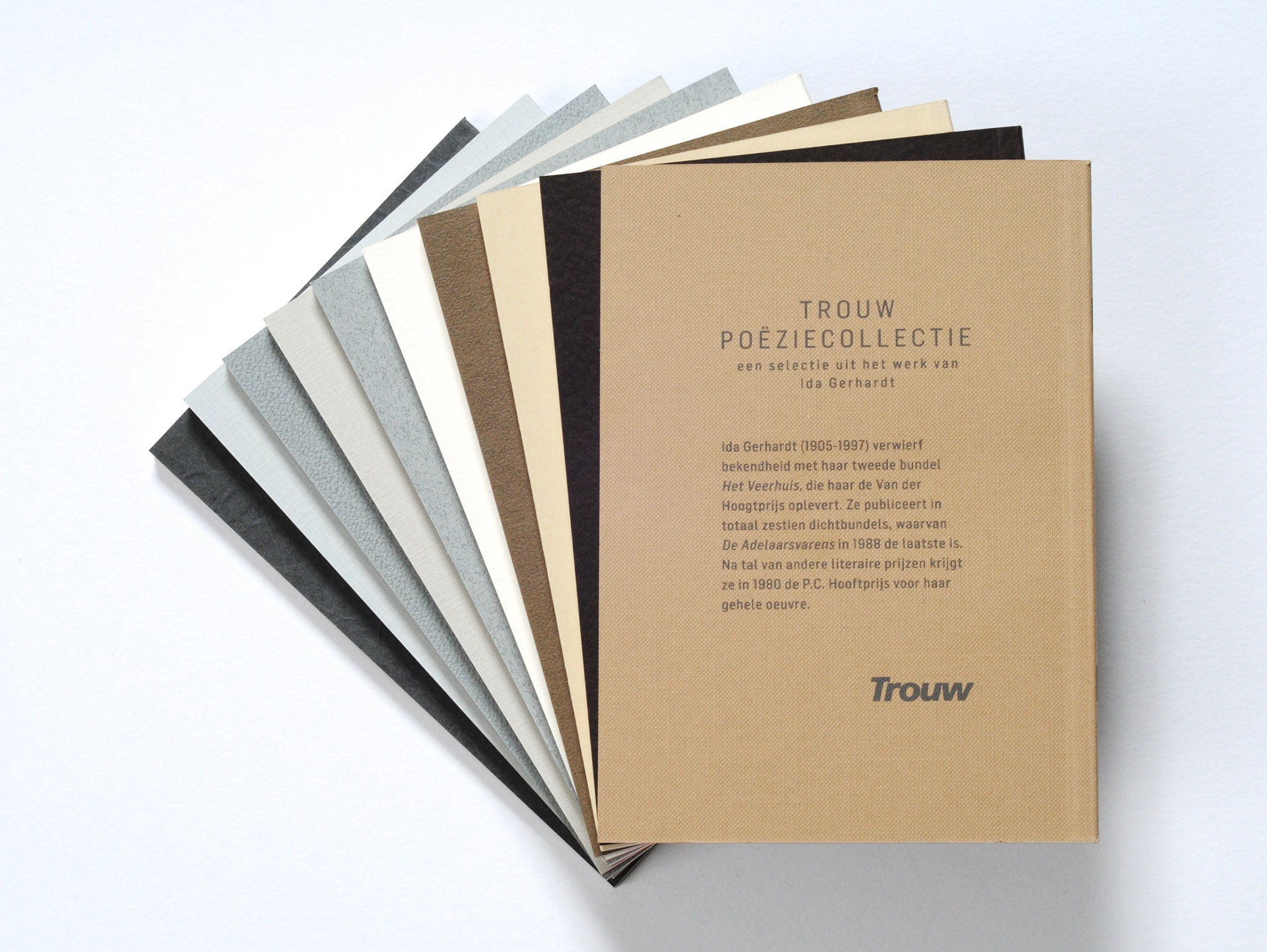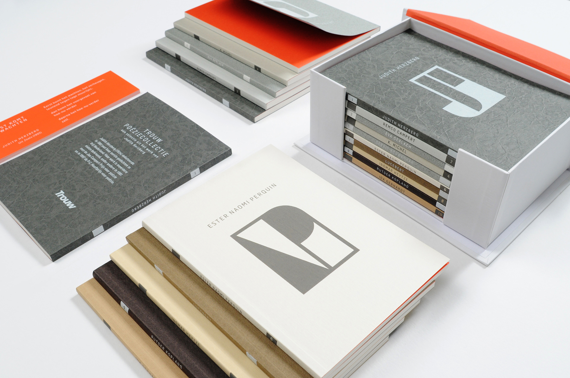
I love poetry. For me poetry is about two things: playing with language, and feeling. I used these two insights to create a tactile range of books to encourage people to get in touch with poetry. As each book showcases a different poet, I wanted to give all ten a distinct identity within one consistent range. The solution was ten papers with a different feel and appearance, but a similar shade. I used deliberately neutral colours so nothing distracted from the textured paper. In fact the only colour is featured on the flyleaf of each book – a single orange page inserted to signify the Dutch nationality of each poet.
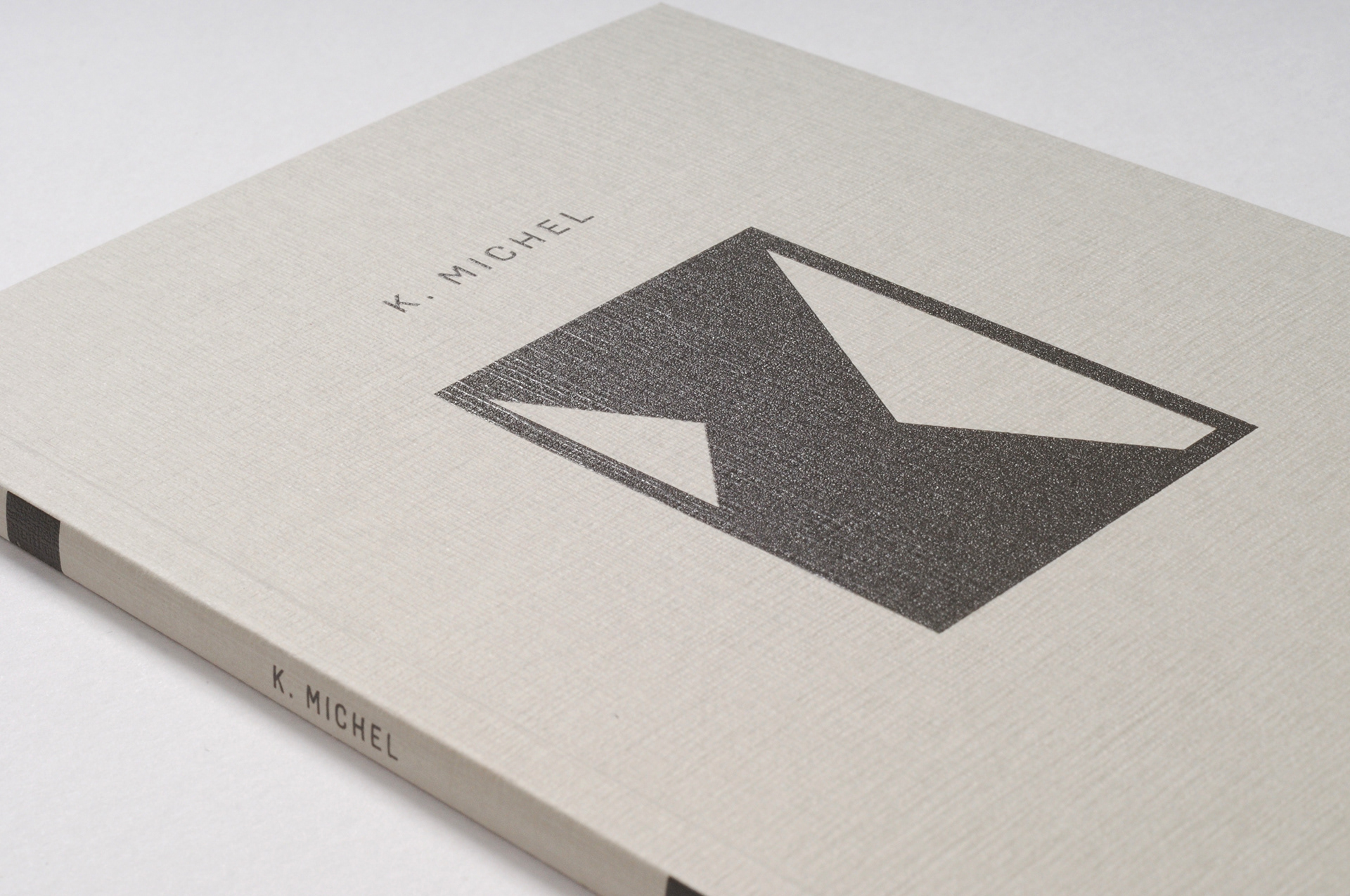
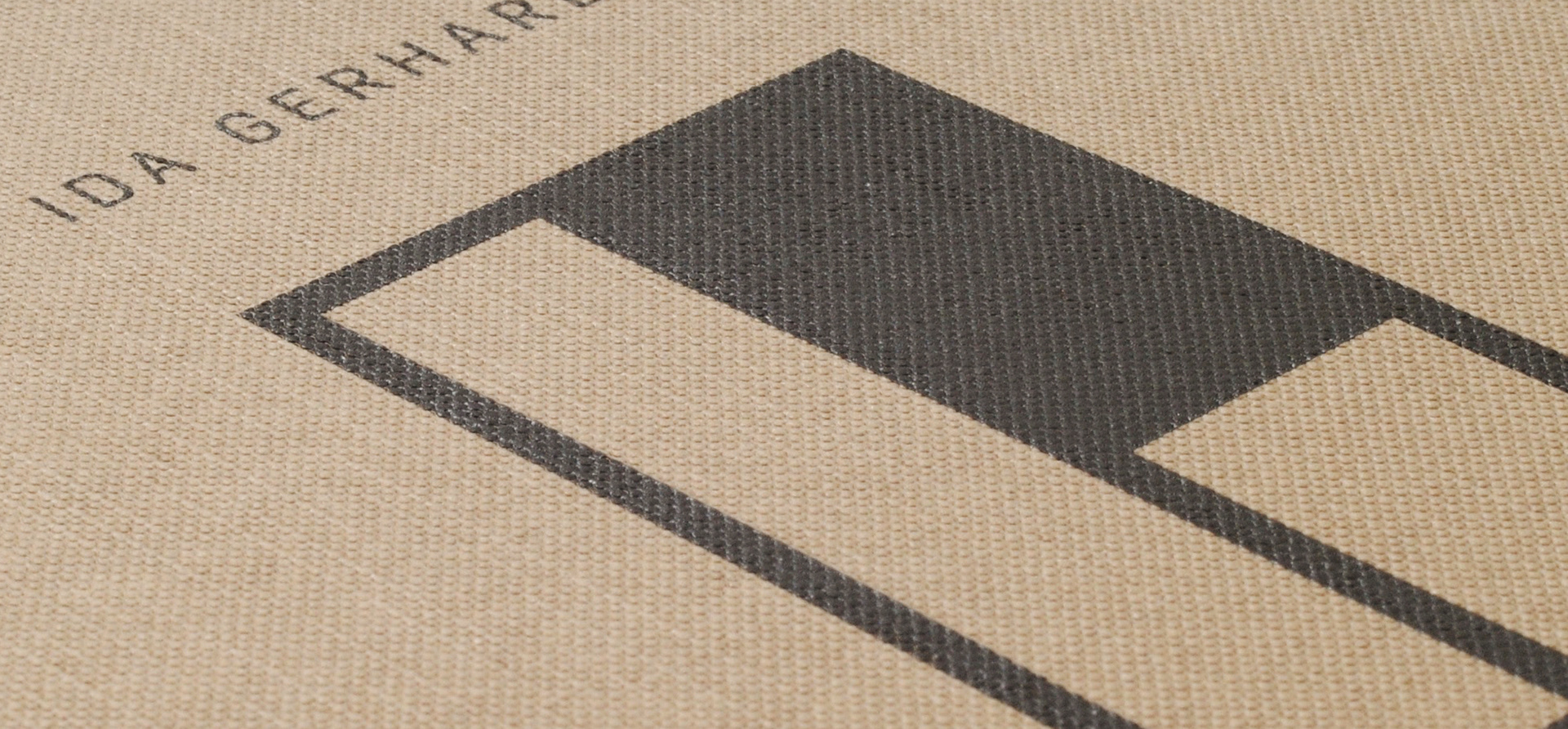
The initial brief was for a range of hardback books, as the client felt that this was more suitable for a high-class range of collectable books. However, this would have made it impossible (harder, even) to play with material as much, so I persisted with softcovers. Luckily the client fell in love with the idea. Everybody else who picks up a book, can't help but touch, stroke and feel the power of poetry. Spotlight: The logo on the cover is a visual translation of the second theme of playing with language, as I played with the initials of each poet to create new forms.